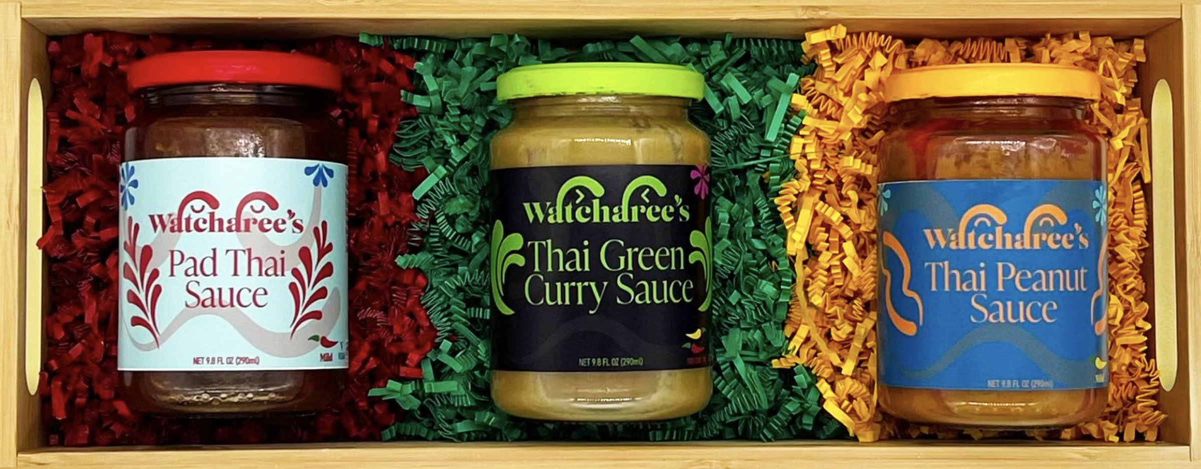
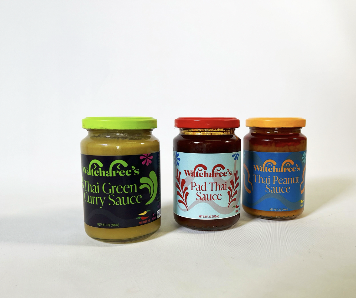
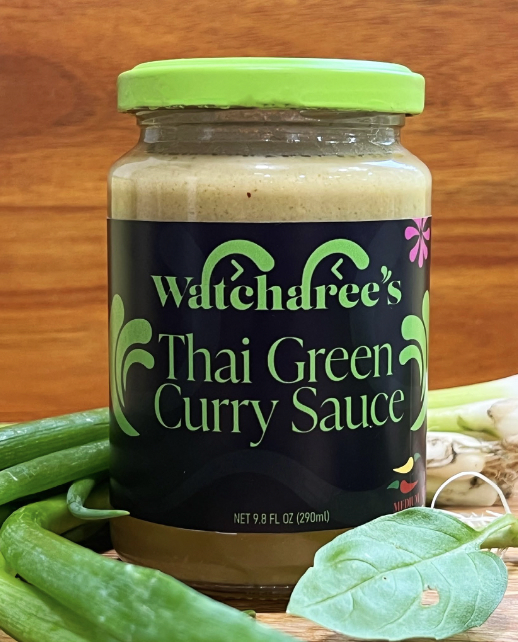
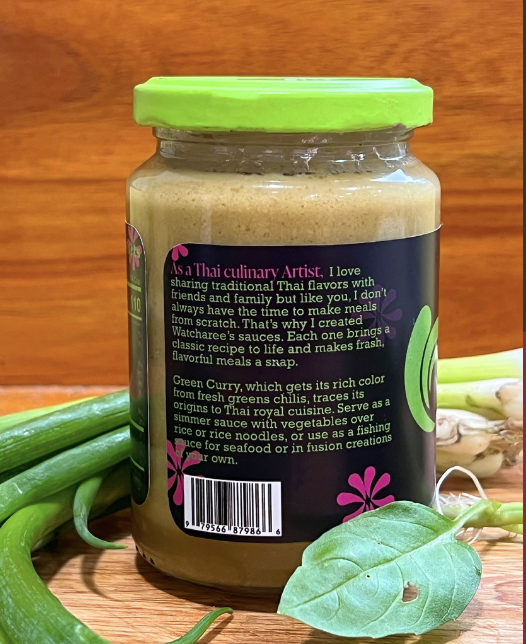
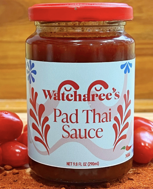
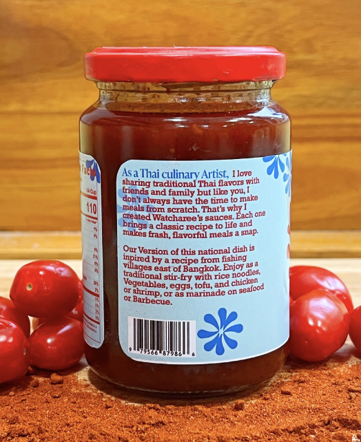
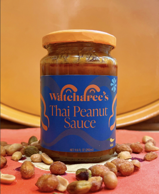
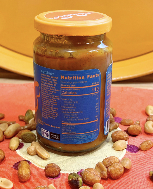
Watcharee’s is a vibrant packaging design project for a premium line of authentic Thai sauces. The brand brings bold Thai flavors into American kitchens with three flagship products: Thai Green Curry Sauce, Pad Thai Sauce, and Thai Peanut Sauce. Each label features a cheerful, modern illustration style with bright, appetizing colors that immediately convey freshness and cultural authenticity while remaining approachable for everyday home cooks.
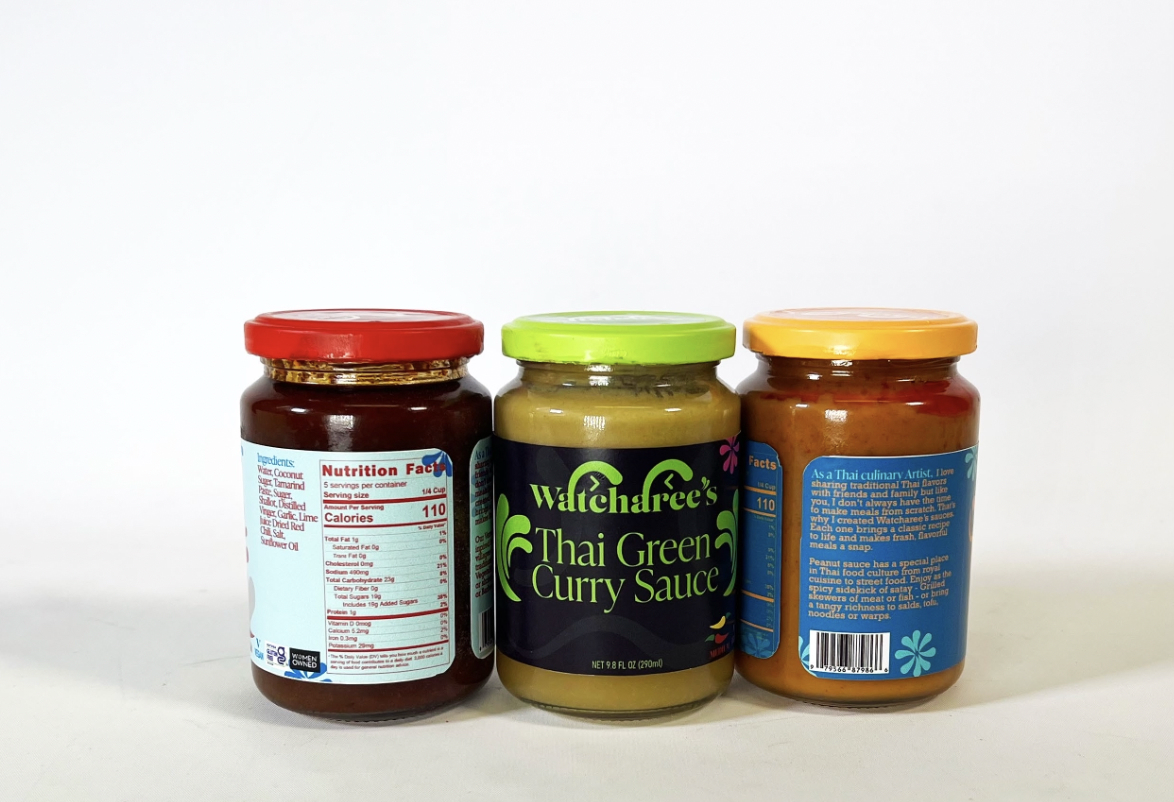
The packaging system uses a consistent visual language with the playful “Watcharee’s” wordmark, colorful lid accents (lime green, red, and orange), and signature decorative elements like chili peppers and flowing waves. The labels balance bold typography with delicate Thai-inspired motifs, creating shelf appeal that feels both premium and fun. Each jar clearly communicates flavor profile and heat level, making the product line easy to navigate.
This project successfully captures the joy and richness of Thai cuisine through thoughtful design. By blending cultural heritage with contemporary packaging aesthetics, Watcharee’s stands out on store shelves and invites consumers to explore bold, restaurant-quality flavors at home. The cohesive identity strengthens brand recognition across the product range while celebrating the vibrant spirit of Thai cooking.